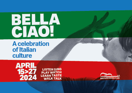
Tribute to Italy, my country, a bespoke typeface is inspired by the sans-serif fonts characteristic of the Italian futurist movement, and by the clean forms of early twentieth-century architecture, designed on a square, minimal grid.
A Bold or rather Heavy bold typeface, suitable for posters communication as in the example.


The Typeface has been enlarged three times to obtain the Italian flag effect


